We take translator feedback about our app very seriously. Which is why when we started looking at how to improve our editor, we combed through all of your suggestions and requests from the past year. We were looking to solve some big pain points that many of you pointed out as hindrances to your productivity. After much hard work, translators and project managers were invited to test out the new features and interface. We listened to feedback, made adjustments and tested some more. The result is a new editor designed to save you heaps of time. It’s quicker, smoother and more efficient so you can accomplish more than ever before!
We really hope you like it. Keep reading to take a tour of the newest features we’ve added that will make your life a whole lot easier.
Overall
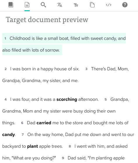
The overall interface has become lighter and cleaner to let you focus on the text and translation and be less distracted by boxes and buttons. We enlarged the space by hiding buttons in a segment menu and moving next word alternatives into the translation field as ghost text:

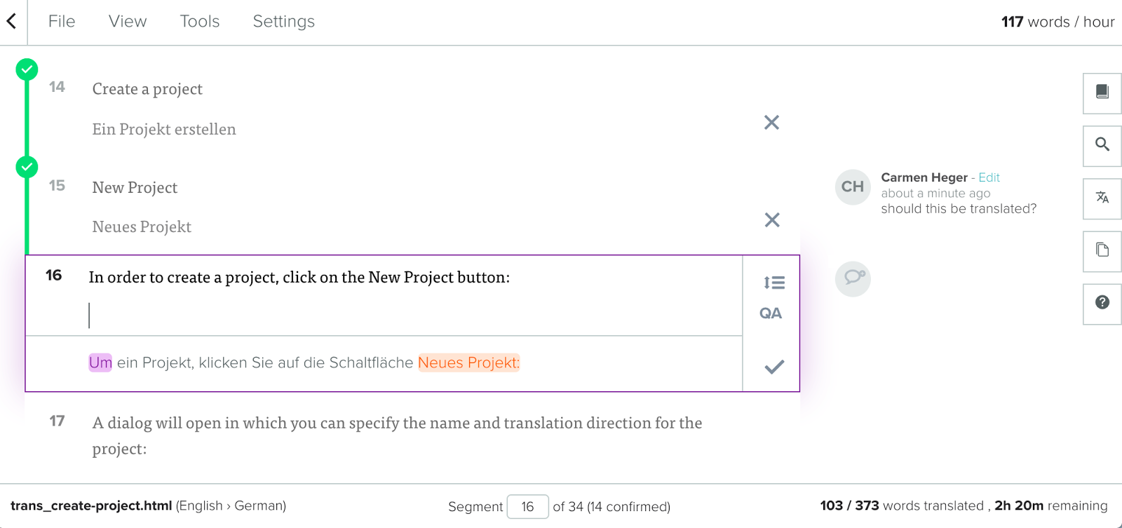
So more segments and thus more document context can be shown on the screen. Finally, the new editor is framed by a fixed header and footer bar including document-level options and information to give you all the necessary tools and statistics without having to scroll or click elsewhere in the application.
Here are a few detailed examples of feedback we received and how we addressed them in the new design:
1. “I could not find an option for X.”
Pain point: Some of you often could not find options to customize the view or the behavior of the editor because they were hidden in the account settings or elsewhere in the app.
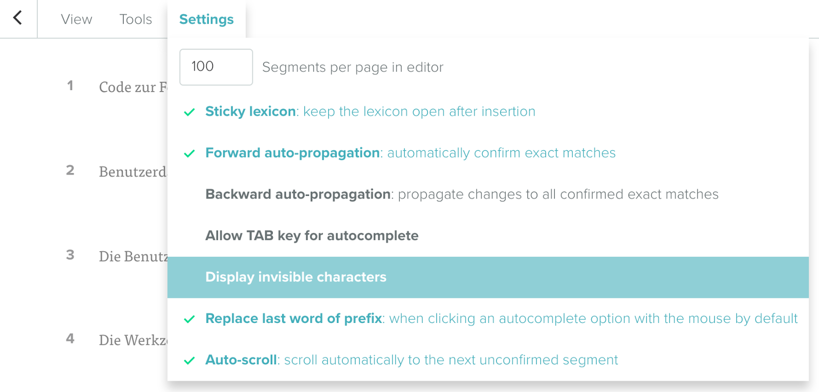
Solution: We moved the settings, tools and viewing options into a menu on top of the editor so that they can be easily found and accessed.
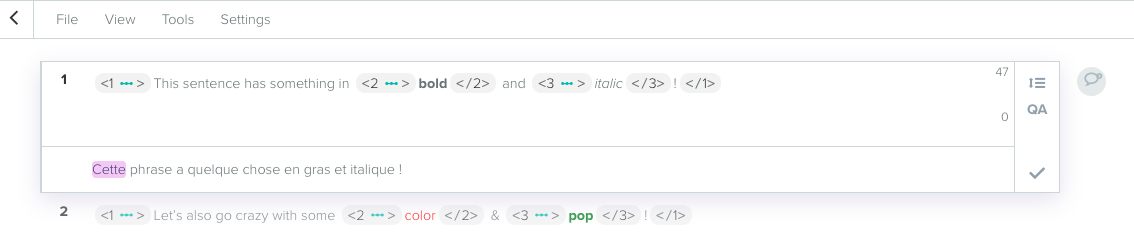
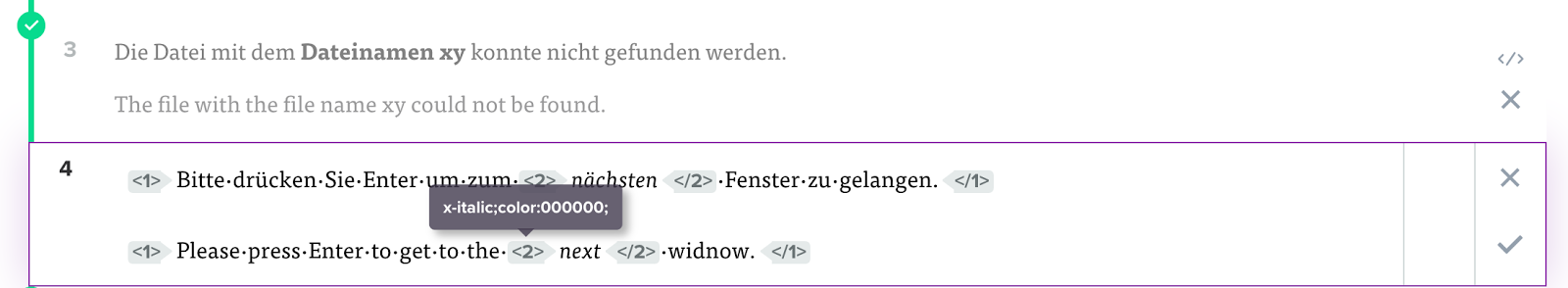
2. Tag handling
Pain point: Upon completion of translation/review, using the separate tags mode to adjust tag positions was often very cumbersome and time-consuming because it was a separate view and translations could not be edited at the same time.
Solution: We removed the tags mode and implemented an on-demand tag editor for each segment so that you can manipulate tags as necessary during your translation work.
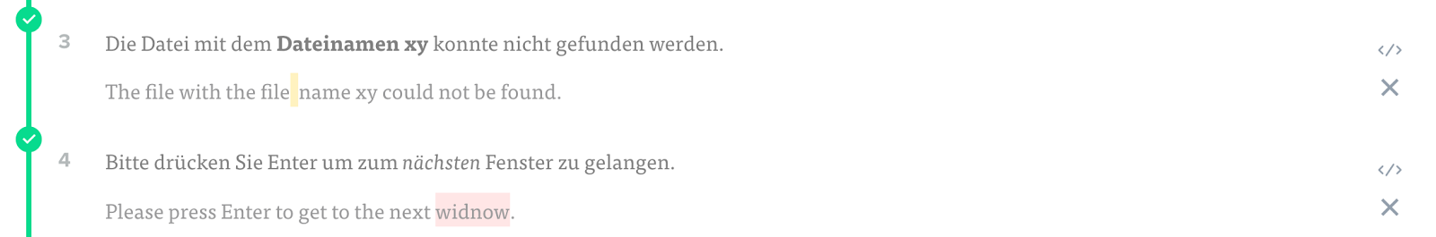
3. QA
Pain point: Similar to the tags mode, the QA mode was separate from the editor and thus more inefficient to work with.
Solution: We also removed the QA mode and now automatically trigger the automatic QA for each segment when confirming it. This enables you to fix potential issues immediately and adopt more of a QC process while you translate instead of a QA process after your work.
4. Reviewing and metadata
Pain point: The dedicated review mode was a different interface from the editor which is uncommon with CAT tools and made it more complex to manage our app. Also it had fewer features available (e.g. MT output, TM matches and other translation aids) and no access to meta information. The lack of metadata made it especially difficult for reviewers to review efficiently.
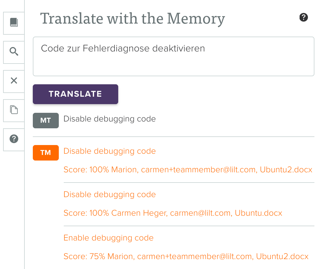
Solution: We deprecated the review interface and merged it into the same editor that is used for translation. That way, the reviewer has access to all features and information that the translator has as well. Additionally, more meta information can be seen when searching the Memory.
Let us know your thoughts on our new editor in the comments section!