

Much of the Internet is in English, and many American web developers rarely think beyond languages like French or Spanish when it comes to internationalization. From a development perspective, such languages function more or less like English, and so the general structure of the webpages tends to assume a layout based on your average book or magazine, with its left-to-right procession of text down the page. Here's the problem: languages with different writing systems exist, and the Internet isn’t just for English speakers. If you're serious about making your content accessible to a global audience, right-to-left functionality is imperative. Here's how you can go about making your website amenable to global compositional structure.
To illustrate the process of adding right-to-left functionality to a left-to-right website, I and two of my peers, Olivia Tsao and Nick Chang, localized a website we created and filled with content from Wikipedia into Arabic. For the record, other languages such as Farsi, Hebrew, Pashto, and Urdu, also would have fit the bill.
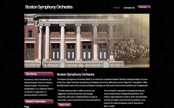
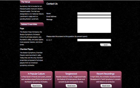
The original website had two pages, looking like this:
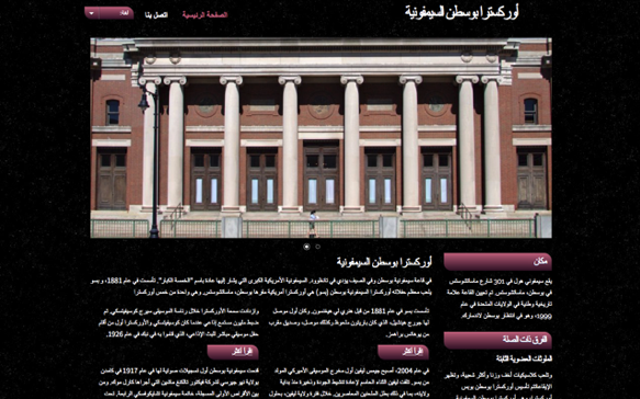
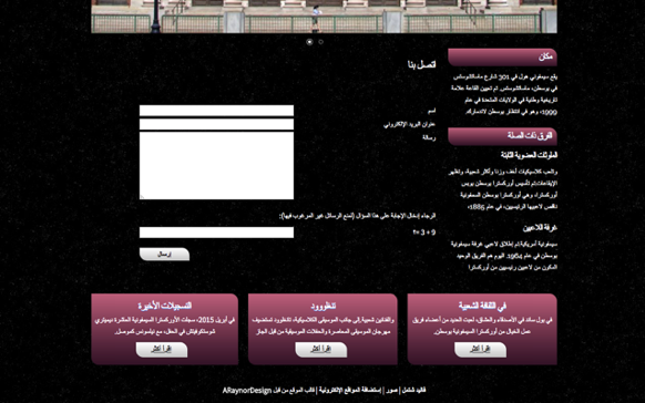
And our final localized website looked like this (none of us know Arabic, so the site is machine translated):
How It's Done
The gist of the process is to mark the Arabic version of the page as right-to-left by adding “dir="rtl"” in the html tag, and then to target the relevant styles of the relevant elements (which is not necessarily all elements, as we will see). This is best explained through an example:
Here’s the style of a hypothetical class:
.class{
color: blue;
border: solid, red;
float: left;
margin-left: 2px;
padding: 2px, 0, 3px, 4px;
}
Method 1: Quick and Dirty
The only styles from this class that we need to change are ones related to layout. The most basic way to do this is to add a section of CSS that targets the same class on right-to-left pages and include only the layout-related styles, each with the values for left and right swapped. Not creating parallel, separate classes saves code and maintains the developer’s ability to update non-layout styles on all pages at once.
The result:
html[dir="rtl"] .class{
float: right;
margin-left: initial;
margin-right: 2px;
padding: 2px, 4px, 3px, 0;
}
It’s important to note here that it is not enough to simply replace margin-left with margin-right, because the original margin-left code from the unmodified .class style will still apply unless margin-left is specifically reset for rtl elements.
Method 2: Getting There
Another method gets around this confusion with the following solution:
html[dir="ltr"] .class{
float: left;
margin-left: 2px;
padding: 2px, 0, 3px, 4px;
}
html[dir="rtl"] .class{
float: right;
margin-right: 2px;
padding: 2px, 4px, 3px, 0;
}
Here, separate layout styles are created for each direction so no sneaky values need to be noticed and reset. Though functional, going through the entire style sheet by hand and painstakingly rewriting every section that has to do with layout is hardly ideal. It is time consuming at best, and at worst it is a mistake-prone way to work, which in turn requires more time for corrections.
Method 3: That's the Ticket
The ideal case is to have a website built using flow-relative values, that is, using “start” and “end” in place of “left” and “right.”
.class{
color: blue;
text-decoration: underline;
float: inline-start;
margin-inline-start: 2px;
padding: logical 2px, 0, 3px, 4px;
}
This way, one block of styling can refer to elements and pages of all directions, and all it takes is “dir="rtl",” a single line of code in the html tag, or even just in a relevant container tag for the browser to interpret the style in the opposite direction. The advantages of this method are obvious: layout styles require half as many lines, which makes it easier to keep track of, and since directions are not styled separately, updates to layout only need to be made once per style. It also gives the added benefit that any styles that should not change can be hard-coded as “left” and “right,” or the relevant element labeled “dir="ltr"” so that they are not rendered backwards. The unfortunate thing is that only Mozilla currently has full support for these values, with the others crucially missing support for the values float: inline-start and float: inline-end.
Don't Forget
Certain elements may require extra attention; often in the form of graphics that need to be flipped. On this site, that was the language picker. Because the vertical line and arrow indicating its dropdown function is in fact a .jpg file, it cannot be flipped automatically. Thankfully, the solution is simple: just add a flipped version of the file to the site’s assets and reference it in the appropriate line of CSS.
It is important to note that right-to-left pages are not automatically the mirror image of left-to-right pages. Media players, for instance, are based off of physical, real world devices which are laid out the same everywhere, and should not be flipped. Material Design has a great piece detailing when and when not to flip elements.
Beyond the Horizon
For one extra demonstration, we localized the site vertically in traditional Chinese (again machine translated).
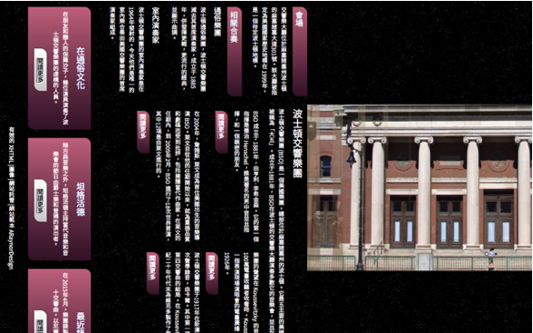
Note: vertical text in Chinese looks best with a font whose punctuation glyphs are centered. Tim Saar has an excellent article on using custom fonts for languages that make use of Chinese characters.
The process is similar to the one described above, though different styles need to be changed. (Note: this is NOT the same thing as just rotating all your elements.) Height and width must be switched for most elements, but float: left and float: right are automatically reinterpreted as top and bottom. float: inline-start and float: inline-end will produce the same result, since flow-relative values can handle vertical orientations as well (using flow-relative values also avoids the need to switch height and width). If this seems convoluted, let us take this moment to meditate on the nature of human language to be messy and full of exceptions, even when that language is code.
Again, however, Mozilla stands alone in its comprehensive support for vertical orientation; buttons and forms display correctly in Firefox but no other browser.
While vertical layouts online are uncommon online, it is not the case that they are never used. The traditional Mongolian script can only be written vertically, as can be seen on the traditional script version of the president of Mongolia’s website:
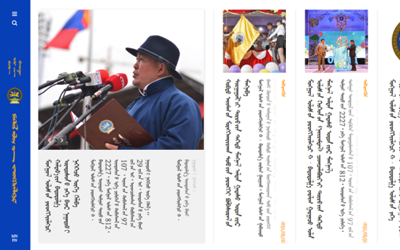
The traditional Mongolian script is now largely confined to Inner Mongolia, in China, while Mongolia itself mostly uses Cyrillic. Chinese and Japanese are more often horizontal than not. There are a multitude of factors that go into determining how the speakers of a language choose to transcribe it, but the mechanics of webpages should have no part in making that decision for them, or in contributing to the homogenization of the world’s forms of writing. Knowing the great variety of possibilities for layout and the power of flow-relative styling (link again because it’s important) can go a long way to preventing that.
Have you had luck using the above methods to acheive multidirectionality on a website? What are some other techniques? Let me know in the comments!
Chris Healy is a freelance translator and localizer, primarily between Chinese and English. He takes websites, apps, and other programs and give them the wings they need to reach a whole new world of users. Read more from Chris here.
.png)